Developer Guide to Document Authoring with Edge Delivery Services. Part 1

This tutorial will guide you through creating your blocks and amending the HTML provided by Edge Delivery Services to ensure that the page has the look and feel you need, with coding examples.
Simple web page served vs rendered.
Hero block
Hero block with mobile variation
Introduction
This is a developer's guide to Document Authoring with Edge Delivery Services. It assumes you have access to a content team to create the content.
I was only joking. Developers can type content.
This tutorial will guide you through creating your blocks and amending the HTML provided by Edge Delivery Services to ensure that the page has the look and feel you need, with coding examples.
Document-based authoring: Edge Delivery Services allows content creators to use familiar tools like Microsoft Word, Google Docs and spreadsheets to author and structure website content, greatly simplifying the process.
All work on a modern website starts with a product owner, a creative person who wants to describe a product or a service. A marketing lead often briefs the product owner. The initial stages usually start with a document, such as a Word or Google Docs file. The idea is fleshed out and shared across the various teams until everybody is happy with the outcome, messaging, and possibly pricing. Sample images and other content are often embedded in the document.
This is then sent to the web content team, which will design a new web page in the site hierarchy or a landing page distinct from the rest of the website. Based on the document's contents, the team may have a design ready or commission one.
The team then copies and pastes the images and text from the document into ‘components’ placed on a ‘template’ within the CMS. Sometimes, they must adjust the copy to fit the page template or component. When changes have been made, the copied and pasted text is placed back into the document as a system of record, and when the web page has been published, the amended document is sent back to the product owner.
This can be a long process. Templates and components need to be built by a busy dev team; the content team is busy creating the next season's campaigns; the author server is down for routine maintenance. The page may not need much design; it may be design-ready with known components, and you might have Edge Delivery Services (Document Authoring with Edge Delivery Services). Good. We will publish the page and step through the processes, adjusting code and styling.
If you do not have Document Authoring with Edge Delivery Services installed, the tutorial at https://aem.live is easy to follow.
Beginning with a simple page,
We begin with a simple page, one with a simple title and simple text in Google Docs:

The document above is named Hello World, and the text states, “Hello World From Edge Delivery Services.” Pressing the Preview button transfers the document as HTML to Edge Delivery Services’ content bus, which stores all the content for the eventual web pages. We also have a code bus and an asset bus.
The system then creates a web page.

Not very complicated. Look at the ‘view page source’ code:
<!DOCTYPE html>
<html>
<head>
<title>Hello World From Edge Delivery Services</title>
<link rel="canonical" href="https://allabout.network/hello-world">
<meta property="og:title" content="Hello World From Edge Delivery Services">
<meta property="og:url" content="https://allabout.network/hello-world">
<meta property="og:image" content="https://allabout.network/default-meta-image.png?width=1200&format=pjpg&optimize=medium">
<meta property="og: imagesecure_url" content="https://allabout.network/default-meta-image.png?width=1200&format=pjpg&optimize=medium">
<meta name="twitter:card" content="summary_large_image">
<meta name="twitter:title" content="Hello World From Edge Delivery Services">
<meta name="twitter:image" content="https://allabout.network/default-meta-image.png?width=1200&format=pjpg&optimize=medium">
<meta name="viewport" content="width=device-width, initial-scale=1">
<script src="/scripts/aem.js" type="module"></script>
<script src="/scripts/scripts.js" type="module"></script>
<link rel="stylesheet" href="/styles/styles.css">
</head>
<body>
<header></header>
<main>
<div>
<p>Hello World From Edge Delivery Services</p>
</div>
</main>
<footer></footer>
</body>
</html>
What happened?
The title, og:title and twitter:title were created from the first and only line in the text, and the canonical meta tag and the og:url were created from the page's location, formed by domain name/Google Drive location.
Also note that the domain name, in this case, main--allaboutv2--ddttom, was taken from my GitHub branch, as well as the repo name and username. If I created a new branch, say testing, then the domain name would change to testing--allaboutv2--ddttom. The double hyphens -- separate each element. This allows for the testing of new code without breaking the site.
A default image tag for og: image :secure_url, og:image, and Twitter:image has been provided. I must include this default image in my codebase.
The viewport tag has been provided.
Finally, the scripts aem.js and scripts.js are loaded
I have an empty header and footer in my Edge Delivery Services implementations. If one wants these to be present, one can create them in Google Drive, following similar rules to page creation.
The central part of the HTML is a div, followed by a paragraph and text. This is a very simple web page.
But what happens inside the browser?
<!DOCTYPE html>
<html>
<head>
<title>Hello World From Edge Delivery Services</title>
<link rel="canonical" href="https://allabout.network/hello-world">
<meta property="og:title" content="Hello World From Edge Delivery Services">
<meta property="og:url" content="https://allabout.network/hello-world">
<meta property="og:image" content="https://allabout.network/default-meta-image.png?width=1200&format=pjpg&optimize=medium">
<meta property="og: imagesecure_url" content="https://allabout.network/default-meta-image.png?width=1200&format=pjpg&optimize=medium">
<meta name="twitter:card" content="summary_large_image">
<meta name="twitter:title" content="Hello World From Edge Delivery Services">
<meta name="twitter:image" content="https://allabout.network/default-meta-image.png?width=1200&format=pjpg&optimize=medium">
<meta name="viewport" content="width=device-width, initial-scale=1">
<script src="/scripts/aem.js" type="module"></script>
<script src="/scripts/scripts.js" type="module"></script>
<link rel="stylesheet" href="/styles/styles.css">
<link rel="stylesheet" href="/styles/fonts.css">
<link rel="stylesheet" href="/blocks/header/header.css">
<link rel="stylesheet" href="/blocks/footer/footer.css">
<link rel="stylesheet" href="/styles/lazy-styles.css">
</head>
<body class="appear">
<header class="header-wrapper">
<div class="header block" data-block-name="header" data-block-status="loaded">
<div>
<div></div>
</div>
</div>
</header>
<main>
<div class="section" data-section-status="loaded" style="">
<div class="default-content-wrapper">
<p>Hello World From Edge Delivery Services</p>
</div>
</div>
</main>
<footer class="footer-wrapper">
<div class="footer block" data-block-name="footer" data-block-status="loaded">
<div>
<div class="section" data-section-status="loaded" style=""></div>
</div>
</div>
</footer>
</body>
</html>
You will see that the DOM has been adjusted or decorated. This is by design. Edge Delivery Services provides the document in a raw HTML format with known patterns. It is up to the developers to shape the HTML to the end requirements.
Edge Delivery Services has added the HTML to load our CSS through style sheets. Two different patterns are used: styles.css and lazy-style.css. As the document is processed, there are three phases: load-eager, load-page, and load-lazy. Load-eager gets the important “before the fold” stuff and everything needed to get the page set up as quickly as possible; load-page is our standard run-of-the-mill stuff, and load-lazy is for actions that don’t matter, such as animations. Further details will be provided later.
Edge Delivery Services has injected extra scripts into the header, inspecting the raw HTML and deciding which components are used. In our case, we have a header and a footer (though both are blank). Edge Delivery Services has decided that we are using the header and footer components. Edge Delivery Services calls the components ‘blocks,’ adding the CSS to the DOM and running the JS from the same folder.
<link rel="stylesheet" href="/blocks/header/header.css">
<link rel="stylesheet" href="/blocks/footer/footer.css">
We are using modern JavaScript techniques in Edge Delivery Services, so the JavaScript is dynamically imported, similar to:
<!-- imports -->
import("/blocks/header/header.js");
import("/blocks/header/footer.js");
Although it uses a more elegant method.
The JavaScript that comes with the blocks can modify and shape the DOM to match the styling requirements. This is a more advanced technique that will be explained later.
The standard “out of the box” causes the body element to be non-displayed.
/* css */
body {
    font-size: var(--body-size);
    margin: 0;
    font-family: var(--body-font-family);
    line-height: 1.6;
    color: var(--text-color);
    background-color: var(--background-color);
    display: none;
    overflow-x: hidden;
}
You should also note that we are using CSS3 variables in our CSS.
When the page is finally ready to be seen, the class “appear” is applied to the body, and the page becomes visible, thus stopping any flashes of unstyled content.
Semantic header and footer elements are added to the DOM, and wrappers are added as a class to each part. The document is split into sections, only one in this raw case. As the JS runs for each ‘block’ or ‘section’, a data-block-status or a section-block-status class with a value of “loaded” is added; this will help prevent this fraction of the DOM from being handled more than once. It's also a signal to the CSS to action new styles.
The raw line of text is given a <div class=”default-content-wrapper”>
In summary, Edge Delivery Services applies clever conventions on top of the Google/Word Doc, sending minimal HTML to the browser with minimal JavaScript, preferably over an HTTP/3 channel. The JavaScript inspects the HTML and then decorates it by following rules.
We have yet to discover the rules in this document. As there is no configuration in the document, Edge Delivery Services uses a technique known as auto-blocking, which uses ‘smart algorithms’ to understand the author's intent.
What’s this about rules?
Documents need descriptions, titles, etc. Edge Delivery Services tries to provide them, but it would be better if the author had control. In document authoring, we use tables to give rules.
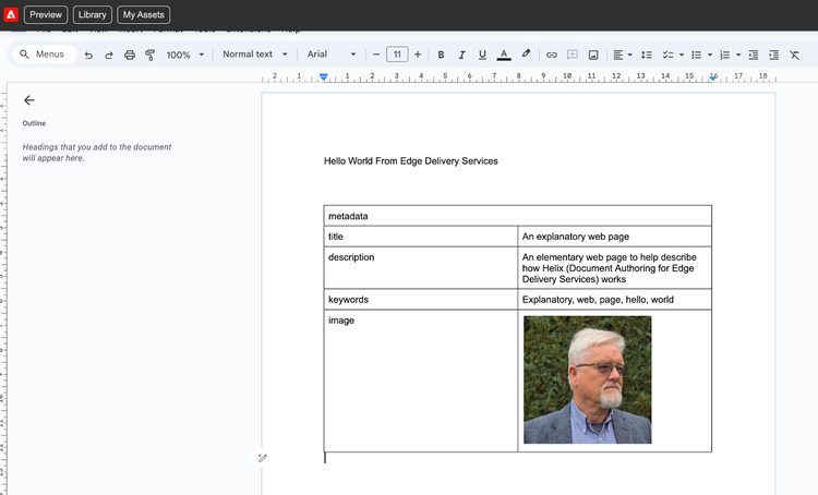
The image above shows our document with a table with two columns. The first row is merged and given the name ‘metadata’. This is the clue to Edge Delivery Services to use this information to adjust the metadata in the HTML.
The left column contains the key phrase, and the right column contains the content. It is traditional to place this table at the foot of the document.
What this metadata does to our HTML
<!DOCTYPE html>
<html>
<head>
<title>An explanatory web page</title>
<link rel="canonical" href="https://allabout.network/hello-world">
<meta name="description" content="An elementary web page to help describe how Edge Delivery Services (Document Authoring for Edge Delivery Services) works">
<meta name="keywords" content="Explanatory, web, page, hello, world">
<meta property="og:title" content="An explanatory web page">
<meta property="og:description" content="An elementary web page to help describe how Edge Delivery Services (Document Authoring for Edge Delivery Services) works">
<meta property="og:url" content="https://allabout.network/hello-world">
<meta property="og:image" content="https://allabout.network/media_145e13ea388af99109b4e34d2c57d40f5fc22d9c9.jpeg?width=1200&format=pjpg&optimize=medium">
<meta property="og: imagesecure_url" content="https://allabout.network/media_145e13ea388af99109b4e34d2c57d40f5fc22d9c9.jpeg?width=1200&format=pjpg&optimize=medium">
<meta name="twitter:card" content="summary_large_image">
<meta name="twitter:title" content="An explanatory web page">
<meta name="twitter:description" content="An elementary web page to help describe how Edge Delivery Services (Document Authoring for Edge Delivery Services) works">
<meta name="twitter:image" content="https://allabout.network/media_145e13ea388af99109b4e34d2c57d40f5fc22d9c9.jpeg?width=1200&format=pjpg&optimize=medium">
<meta name="viewport" content="width=device-width, initial-scale=1">
<script src="/scripts/aem.js" type="module"></script>
<script src="/scripts/scripts.js" type="module"></script>
<link rel="stylesheet" href="/styles/styles.css">
</head>
<body>
<header></header>
<main>
<div>
<p>Hello World From Edge Delivery Services</p>
</div>
</main>
<footer></footer>
</body>
</html>
In this HTML, you can see that the title matches our title and that the description is mapped to the description fields in the og:description and twitter:description fields.
A new meta field has been added:
<meta name="keywords" content="Explanatory, web, page, hello, world">
This ability to add rules to the document is critical to creating interesting web pages.
We can add one of the built-in rules. If they contain code and styling, they are called blocks.
Add a block called columns:
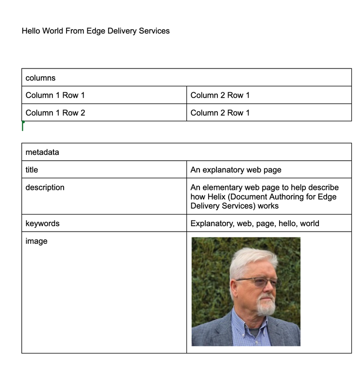
Now inspect the view page source. We will look at <main> as we have not changed the metadata.
<main>
      <div>
        <p>Hello World From Edge Delivery Services</p>
        <div class="columns">
          <div>
            <div>Column 1 Row 1</div>
            <div>Column 2 Row 1</div>
          </div>
          <div>
            <div>Column 1 Row 2</div>
            <div>Column 2 Row 1</div>
          </div>
        </div>
      </div>
    </main>
The block name (columns) is now held within a div element with a class of “columns.” This signals Edge Delivery Services to adjust the DOM, as we will see later.
Although we used a table to define our block, Edge Delivery Services used div elements to separate each cell. We have not gone back in time and are about to style tables. Edge Delivery Services is much more intelligent than that.
Inspecting the rendered DOM, where .…. represents unchanged parts
<!DOCTYPE html>
<html>
……
<meta property="og:image" content="https://allabout.network/media_145e13ea388af99109b4e34d2c57d40f5fc22d9c9.jpeg?width=1200&format=pjpg&optimize=medium">
--
<link rel="stylesheet" href="/blocks/columns/columns.css">
……
<main>
<div class="section columns-container" data-section-status="loaded" style="">
<div class="default-content-wrapper">
<p>Hello World From Edge Delivery Services</p>
</div>
<div class="columns-wrapper">
<div class="columns block columns-2-cols" data-block-name="columns" data-block-status="loaded">
<div>
<div>Column 1 Row 1</div>
<div>Column 2 Row 1</div>
</div>
<div>
<div>Column 1 Row 2</div>
<div>Column 2 Row 1</div>
</div>
</div>
</div>
</div>
</main>
………
</html>
The image in og:image and og: imagesecure_url has been replaced by the URL for the image in the metadata table, which was the default.
This is our first time using an image in our sample document. You will notice that the doc format has embedded the image into the document, and its original name is lost. Edge Delivery Services creates a unique ID. If the same image is used in multiple places, the ID is the same; it is a hash of the image. You will notice in the HTML a query string: ?width=1200&format=pjpg&optimize=medium"
The & is an HTML entity representing the ampersand character (&). It is inserted in the string to disambiguate the parameters. So, it states that the image should be resized to 1200 pixels in width and served as a progressive jpeg with medium optimisation. Noting this, it is best to provide an image 1200 pixels wide in the image metadata portion of the page. Edge Delivery Services will stretch or shrink your image to fit if you do not.
We will add images to our website and see what Edge Delivery Services offers later.
The CSS for columns has been added to the DOM:
<link rel="stylesheet" href="/blocks/columns/columns.css">
At the same time as this decoration, the js in /blocks/columns/columns.js has been imported and executed.
A div with class=”columns-wrapper” has been added to the DOM just before the text.
The original div class = ”columns” has been extended, and new classes have been added: block to inform Edge Delivery Services that this is a block and columns-2-cols to ensure that the correct styling for a two-column div is applied.
The code in column.js does this decoration to transform the raw HTML into a structure that can be styled.
//js
export default function decorate(block) {
  const cols = [...block.firstElementChild.children];
  block.classList.add(`columns-${cols.length}-cols`);

  // setup image columns
  [...block.children].forEach((row) => {
    [...row.children].forEach((col) => {
      const pic = col.querySelector('picture');
      if (pic) {
        const picWrapper = pic.closest('div');
        if (picWrapper && picWrapper.children.length === 1) {
          // picture is only content in column
          picWrapper.classList.add('columns-img-col');
        }
      }
    });
  });
}
The code above reads the number of divs in the first child and gets the count; it then adds the class with a count derived from the number of children.
The last part of the js looks for picture elements - added at the document level - and decorates the cell with columns-img-col if found.
We are adjusting our document and placing the same image with author details at the top of the page.
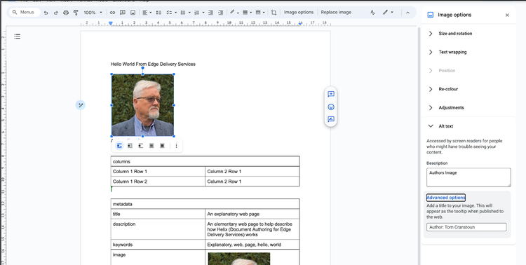
I have opened the image options panel in Google Drive to show the placement of alt text and title of this image. I am using the same image as I used in the metadata; we will be able to see the different treatments given to the image by Edge Delivery Services.
Preview the page in the browser.
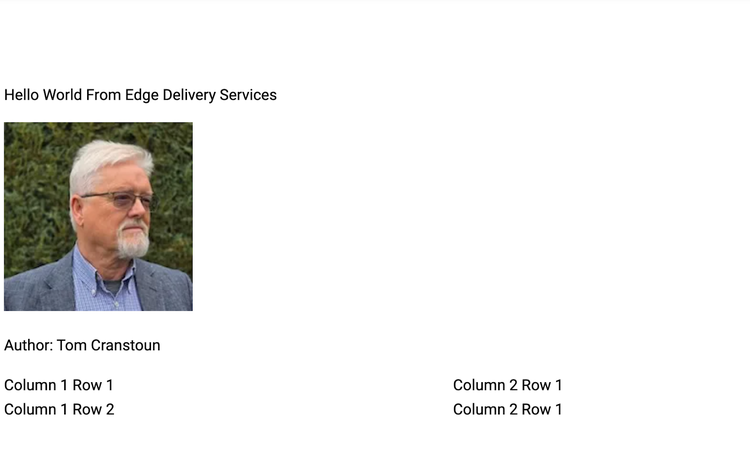
Inspecting the view page source, from main onwards:
<main>
<div>
<p>Hello World From Edge Delivery Services</p>
<p>
<picture>
<source type="image/webp" srcset="./media_145e13ea388af99109b4e34d2c57d40f5fc22d9c9.jpeg?width=2000&format=webply&optimize=medium" media="(min-width: 600px)">
<source type="image/webp" srcset="./media_145e13ea388af99109b4e34d2c57d40f5fc22d9c9.jpeg?width=750&format=webply&optimize=medium">
<source type="image/jpeg" srcset="./media_145e13ea388af99109b4e34d2c57d40f5fc22d9c9.jpeg?width=2000&format=jpeg&optimize=medium" media="(min-width: 600px)">
<img loading="lazy" alt="Authors Image" data-title="Author: Tom Cranstoun" src="./media_145e13ea388af99109b4e34d2c57d40f5fc22d9c9.jpeg?width=750&format=jpeg&optimize=medium" width="198" height="198">
</picture>
</p>
<p>Author: Tom Cranstoun</p>
<div class="columns">
<div>
<div>Column 1 Row 1</div>
<div>Column 2 Row 1</div>
</div>
<div>
<div>Column 1 Row 2</div>
<div>Column 2 Row 1</div>
</div>
</div>
</div>
</main>
Keep in mind the original og:image metadata:
<meta property="og:image" content="https://allabout.network/media_145e13ea388af99109b4e34d2c57d40f5fc22d9c9.jpeg?width=1200&format=pjpg&optimize=medium">
The HTML provided shows that the picture element was used. The HTML picture element is a powerful tool for creating websites. It allows web developers to specify multiple image sources, ensuring the browser displays the most appropriate image for the user's device and network conditions. Additionally, the picture element provides a fallback mechanism for browsers that do not support it, ensuring users always see some form of the image.
The picture element constructed has the following pattern. I have abstracted the name and shortened the optimisation part to show the layout.
<picture>
<source type="image/webp" srcset="name.jpeg?width=2000&format=webply" media="(min-width: 600px)">
<source type="image/webp" srcset="name.jpeg?width=750&format=webply">
<source type="image/jpeg" srcset="name.jpeg?width=2000&format=jpeg" media="(min-width: 600px)">
<img loading="lazy" alt="Authors Image" data-title="Author: Tom Cranstoun" src="name.jpeg?width=750&format=jpeg>
</picture>
This element has media query conditions that choose the correct width for a mobile device (min-width:600). There are format options to choose WebP (format=webply) or JPEG (format=jpeg). The browser will use this mix to select the correct image for the viewport size and browser capabilities. Finally, there is a fallback - for browsers or tools that need help understanding the picture element (few these days).
Inspecting the HTML code reveals that the same image is used as the source everywhere. The query-string modifier changes what is served to the browser. In our case:
./media_145e13ea388af99109b4e34d2c57d40f5fc22d9c9.jpeg
Creating a bio block
We will improve the content team's experience by creating a bio block and writing some JavaScript and CSS to display the image title as the bio's byline. Search for the meta author if the image lacks a title.
<meta name="author" content="Tom Cranstoun">
The first step is to extend the page metadata table to add a new entry: author. Remember, the first column is case-insensitive, but the second is not.

The next step is to encapsulate the content in a new bio block and add the text underneath.
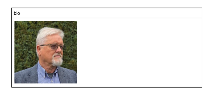
Now, we must style the block and write the JavaScript to decorate it however we want.
Inspect the new block “bio” when looking at the view source page for the raw HTML:
<div class="bio">
<div>
<div>
<picture>
<source type="image/webp" srcset="./media_145e13ea388af99109b4e34d2c57d40f5fc22d9c9.jpeg?width=2000&format=webply&optimize=medium" media="(min-width: 600px)">
<source type="image/webp" srcset="./media_145e13ea388af99109b4e34d2c57d40f5fc22d9c9.jpeg?width=750&format=webply&optimize=medium">
<source type="image/jpeg" srcset="./media_145e13ea388af99109b4e34d2c57d40f5fc22d9c9.jpeg?width=2000&format=jpeg&optimize=medium" media="(min-width: 600px)">
<img loading="lazy" alt="" src="./media_145e13ea388af99109b4e34d2c57d40f5fc22d9c9.jpeg?width=750&format=jpeg&optimize=medium" width="198" height="198">
</picture>
</div>
</div>
</div>
We know that Edge Delivery Services decorates our block when it downloads, looking at the rendered DOM, just the bio block:
<div class="bio-wrapper">
<div class="bio block" data-block-name="bio" data-block-status="loaded">
<div>
<div>
<picture>
<source type="image/webp" srcset="./media_145e13ea388af99109b4e34d2c57d40f5fc22d9c9.jpeg?width=2000&format=webply&optimize=medium" media="(min-width: 600px)">
<source type="image/webp" srcset="./media_145e13ea388af99109b4e34d2c57d40f5fc22d9c9.jpeg?width=750&format=webply&optimize=medium">
<source type="image/jpeg" srcset="./media_145e13ea388af99109b4e34d2c57d40f5fc22d9c9.jpeg?width=2000&format=jpeg&optimize=medium" media="(min-width: 600px)"> <img loading="lazy" alt="" src="./media_145e13ea388af99109b4e34d2c57d40f5fc22d9c9.jpeg?width=750&format=jpeg&optimize=medium" width="198" height="198">
</picture>
</div>
</div>
</div>
</div>
We see that the <div class=”bio”> has been replaced with
<div class="bio-wrapper">
<div class="bio block" data-block-name="bio" data-block-status="loaded">
This allows us to target CSS on the block.
We will put the bio picture into a circle.
The CSS styling is stored in /blocks/bio/bio.css
Developer Guide to document authoring with Edge Delivery Services
.bio-wrapper .bio.block img {
    border-radius: 50%;
    object-fit: cover;
}
We now want to add some JavaScript to retrieve the alt text or, if not present, read the meta name=author content into a JavaScript variable named author, using the variable to enhance the bio element display. The content team no longer need to write the author's name if the metadata is correct, either on the alt or the meta author tag.
Create the new \blocks\bio\bio.js
//js
export default function decorate(block) {
  // Find the <img> element within the .bio.block
  const imgElement = document.querySelector('.bio.block img');

  let author = '';

  // Check if the <img> element has a non-empty alt attribute
  if (imgElement && imgElement.getAttribute('alt')) {
    author = imgElement.getAttribute('alt');
  }

  // If the alt attribute is empty or not present, fall back to the   <meta> tag's author content
  if (!author) {
    const metaAuthor = document.querySelector('meta[name="author"]');
    if (metaAuthor) {
      author = metaAuthor.getAttribute('content');
    }
  }

  // Create a new <strong> element to hold the author name
  const authorElement = document.createElement('strong');
  authorElement.textContent = author;

  // Find the .bio.block element
  const bioBlock = document.querySelector('.bio.block');

  // Insert the author element as the last child of the .bio.block element
  bioBlock.appendChild(authorElement);
}
Previewing the page:
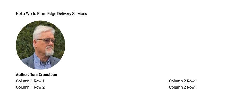
By adding classes, we can create variations of our block. We add extra names in brackets after the block's name. We now make a highlighted variation of the bio block.
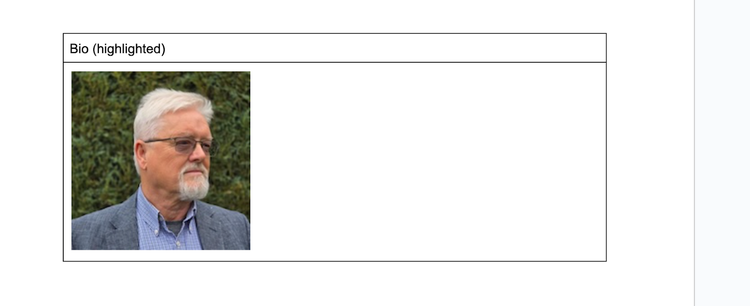
We adjust our styling in \blocks\bio\bio.css
.bio-wrapper .bio.block img {
border-radius: 50%;
object-fit: cover;
}
.bio-wrapper .bio.block.highlighted img {
border: 2px solid blue;
box-sizing: border-box;
}
As we have the circle (border-radius….), the browser version shows the image with a 2px blue border.
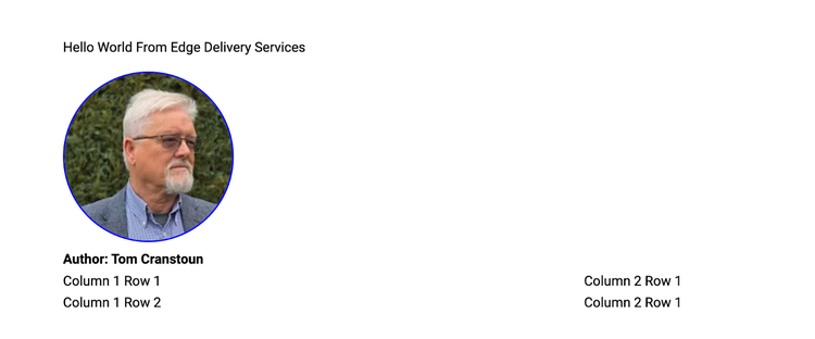
The ability to create many block variations is a powerful feature that can add visual interest and interactivity to a web page. Using styling and JavaScript introspection, unique and engaging blocks can be created.
Here are some examples of how styling and JavaScript introspection can be used to create block variations:
- Styling:
- Use different colours, fonts and sizes to create various visual styles.
- Add borders, shadows and other effects to create depth and dimension.
- Use CSS animations and transitions to create dynamic effects.
- JavaScript introspection:
- Use JavaScript to get and set the properties of a block.
- Use JavaScript to add and remove event listeners to a block.
- Use JavaScript to create custom animations and interactions.
Here are some additional tips for creating variations of a block:
- Use a consistent design system:
- This will help ensure your blocks have a cohesive look and feel.
- Start with a simple design:
- This will make it easier to add variations later.
- Use modular components:
- This will make it easier to reuse code and create new variations.
- Test your variations:
- This will help to ensure that your variations work as expected.
By combining styling and JavaScript introspection, blocks can be created that are visually appealing and interactive, creating a more engaging and enjoyable user experience.
Creating a hero block
A hero block, frequently called the hero image or hero banner, is crucial at the start of many web pages. This large, page-wide image is strategically positioned to capture the visitor's attention upon landing immediately.
We begin by inserting a table in the document. The first cell is named Hero, and the image is in the second cell.
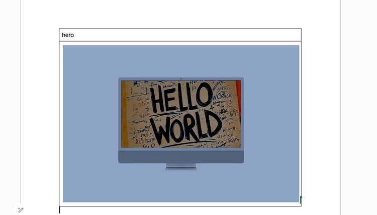
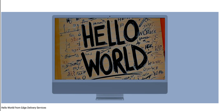
When we preview this, the hero takes up the entire screen width.
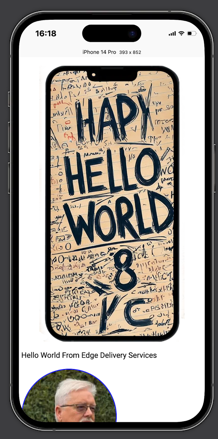
Even when viewed on a mobile device, it looks good.
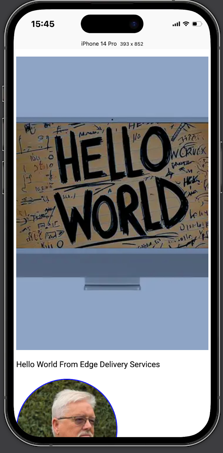
You may remember that Edge Delivery Services makes a fresh version at different resolutions (picture element, media-query), transforming JPEG into WebP format. This may distort the mobile view by crushing the pixels, giving you a fuzzy appearance.
You may want a different hero on a mobile, which is an editorial decision. The auto-scaled version of the desktop hero sometimes needs to be fixed for a mobile hero.
How do we do this? With a slight modification of the hero table and a bit of JavaScript.
Add a suitable mobile image in a two-cell wide table.
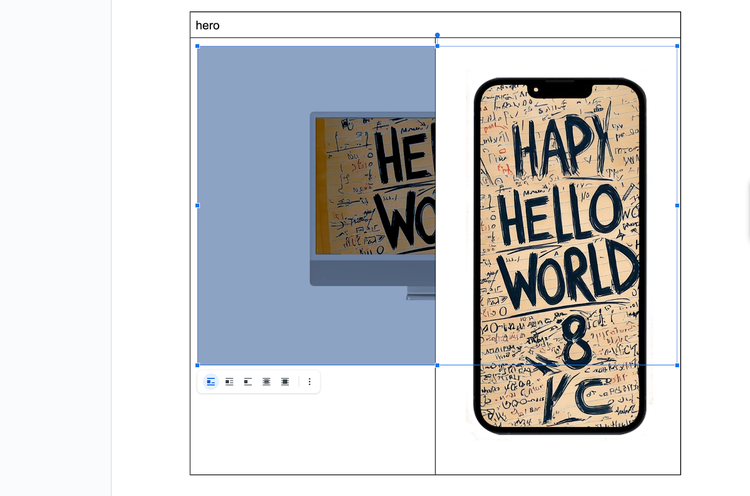
When this is previewed, we are shocked. It is not what we wanted. We ended up with the second image as the hero; the desktop image got lost.
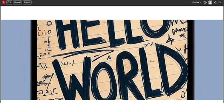
Looking at the rendered HTML:
<div class="hero-wrapper">
<div class="hero block" data-block-name="hero" data-block-status="loaded">
<div>
<div>
<picture>
<source type="image/webp" srcset="./media_1d630d23debaab5c10fa538dd115999958709e9a1.png?width=2000&format=webply&optimize=medium" media="(min-width: 600px)">
<source type="image/webp" srcset="./media_1d630d23debaab5c10fa538dd115999958709e9a1.png?width=750&format=webply&optimize=medium">
<source type="image/png" srcset="./media_1d630d23debaab5c10fa538dd115999958709e9a1.png?width=2000&format=png&optimize=medium" media="(min-width: 600px)"> <img loading="eager" alt="" src="./media_1d630d23debaab5c10fa538dd115999958709e9a1.png?width=750&format=png&optimize=medium" width="1600" height="1066">
</picture>
</div>
<div>
<picture>
<source type="image/webp" srcset="./media_1186987bb430ec405d0e14e60f8e7c47a00290f0d.png?width=2000&format=webply&optimize=medium" media="(min-width: 600px)">
<source type="image/webp" srcset="./media_1186987bb430ec405d0e14e60f8e7c47a00290f0d.png?width=750&format=webply&optimize=medium">
<source type="image/png" srcset="./media_1186987bb430ec405d0e14e60f8e7c47a00290f0d.png?width=2000&format=png&optimize=medium" media="(min-width: 600px)"> <img loading="lazy" alt="" src="./media_1186987bb430ec405d0e14e60f8e7c47a00290f0d.png?width=750&format=png&optimize=medium" width="889" height="1600">
</picture>
</div>
</div>
</div>
</div>
Add code to the hero block.
As expected, we see two picture elements. We need to decorate this part of the site to combine them. By convention, the first row is the desktop image, and the second is the mobile image.
We add code to the empty \blocks\hero\hero.js
//js
export default function decorate(block) {
  const firstPicture = document.querySelector('.hero > div:first-of-type picture');
  const secondPicture = document.querySelector('.hero > div:first-of-type > div:nth-of-type(2) picture');

  if (firstPicture && secondPicture) {
    // Select the second source element from the second picture element
    const secondSource = secondPicture.querySelector('source:nth-of-type(2)');
    if (secondSource) {
      const newSource = secondSource.cloneNode(true);
      const firstPictureSecondSource = firstPicture.querySelector('source:nth-of-type(2)');
      if (firstPictureSecondSource) {
        firstPicture.replaceChild(newSource, firstPictureSecondSource);
      } else {
        firstPicture.appendChild(newSource);
      }
      secondPicture.remove();
    }
  }
}
The code performs manipulations on the picture elements. It starts by selecting two <picture> elements: the first one is located inside the first <div> element within an element with the class name hero, and the second one is located inside the second <div> element within the first <div> element of the hero class.
If both these <picture> elements exist, the code proceeds to do the following:
1. It selects the second <source> element from the second <picture> element.
2. If the second <source> element exists, it creates a copy of it.
3. It then checks if the first <picture> element has a second <source> element.
If it does, the code replaces the existing second <source> element in the first <picture> element with the copied <source> element from the second <picture> element.
If it doesn't, the code adds the copied <source> element as a new child of the first <picture> element.
4. Finally, the code removes the document's second <picture> element.
If only one picture element exists, the code does nothing, and the hero still works.
Just a little touch of magic.
See the screenshots below:
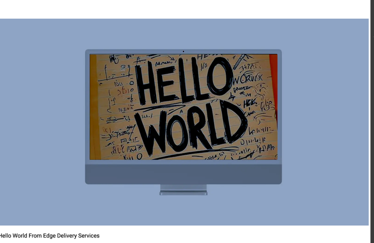
Desktop image
Mobile image
Finally, the rendered picture elements - following the adjustments:<div class="hero-wrapper">
<div class="hero block" data-block-name="hero" data-block-status="loaded">
<div>
<div>
<picture>
<source type="image/webp" srcset="./media_1d630d23debaab5c10fa538dd115999958709e9a1.png?width=2000&format=webply&optimize=medium" media="(min-width: 600px)">
<source type="image/webp" srcset="./media_1186987bb430ec405d0e14e60f8e7c47a00290f0d.png?width=750&format=webply&optimize=medium">
<source type="image/png" srcset="./media_1d630d23debaab5c10fa538dd115999958709e9a1.png?width=2000&format=png&optimize=medium" media="(min-width: 600px)"> <img loading="eager" alt="" src="./media_1d630d23debaab5c10fa538dd115999958709e9a1.png?width=750&format=png&optimize=medium" width="1600" height="1066">
</picture>
</div>
<div> </div>
</div>
</div>
</div>
The two picture elements have been merged into a single element.
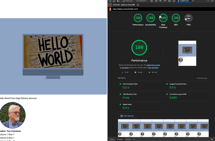
All this work has been done without affecting the Lighthouse page speed.
If you follow along, you will end up with a very similar page. See here, An explanatory web page
Related Articles